
Monday, December 19, 2011
Final Exam
Wednesday, December 14, 2011

Monday, December 12, 2011

Thursday, December 8, 2011

Thursday, December 1, 2011

Wednesday, November 30, 2011

Monday, November 21, 2011


Thursday, November 17, 2011

Monday, November 14, 2011

Friday, November 4, 2011
Tuesday, November 1, 2011
Monday, October 31, 2011

Friday, October 28, 2011

Wednesday, October 19, 2011

Friday, October 14, 2011

Friday, October 7, 2011

Monday, October 3, 2011

Wednesday, September 28, 2011

Tuesday, September 20, 2011

Thursday, September 15, 2011

Tuesday, September 13, 2011
Quote

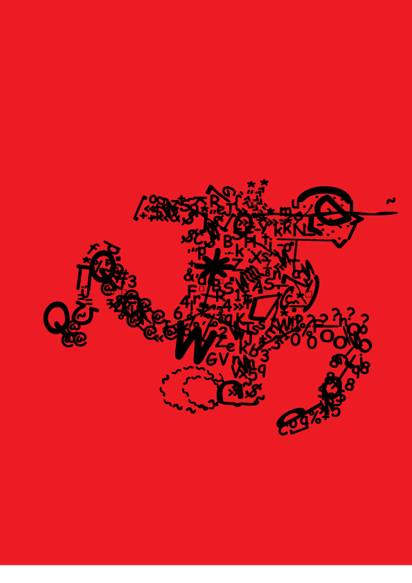
I changed a couple of fonts and spacing issues. Also instead of Red its now dark purple to give more of a mood of sadness or grief along with the combination of font i used. The one with black and purple is the revised quote and the black and red was what i first started with.

Friday, September 9, 2011

Wednesday, September 7, 2011

Wednesday, August 31, 2011
About Me
Well the Names Cody Zavala if you couldn't figure that out haha im a sophomore here at consol and this is my 2nd year even in college station... ha yea i moved here freshman year from a small small small.... Small Town called Palacios, Texas and i enjoy anything occupying and fun any questions just hit me up and ask away haha
Wednesday, August 24, 2011
10/3

The way they have the colors mixed to fit is very interesting. The people in the back are all one color while the person in the center is enlarged and shown better. Also the tree is eye catching with the color fade on it to make it blackish.
*This image uses the tree as a repetition used for the top of the picture.
*Orange in this picture makes the dude look like hes hiding and about to attack the guys in the back
*Also there is a line that goes in a triangle pattern

The way they have the shadows react with the lights is very nice. The huge missile silo in the back looks nice and interesting on how they were capable of doing that. Also all the colors make this look real.
*The walls on the house are a pattern that they switched up every other window to make it look more abandoned
*The clouds and the missile are both a rhythm to make the sky look slanted and stormy

This car looks very elegant on the racing speedway turned like that.Its also good how the sun shines on certain parts of the car. The overall colors on this car also give it a look of uniqueness.
*The curve in the road and stands let us know the image is on the beginning of a turn
*The lights on top of the stands are also forming a straight repetitive line
*The car also has a rhythm with the amount of sun glare on it
*The curve in the road and stands let us know the image is on the beginning of a turn
*The lights on top of the stands are also forming a straight repetitive line
*The car also has a rhythm with the amount of sun glare on it

This image has just the right amount of purple that makes it look good. Also the ocean or bay makes it have a feeling of peace. and the clouds help give this image more cause of being good.
*The shore on the other end forms a straight line in this image also the clouds are forming a straight line too
*The shore water has a rhythm since the water looks still and is purple/pinkish with the sky
*The shore on the other end forms a straight line in this image also the clouds are forming a straight line too
*The shore water has a rhythm since the water looks still and is purple/pinkish with the sky

This image is hard to realize how they made it have neon lights on the lion. They also made this image yellow/orange which is almost the same as a lions fur. Also i wonder how they got rid of the eye.
*The orange/yellow is a repetitive color that gives this an actual look of a lion
*Orange and yellow colors on the lion give it rhythm
*The orange/yellow is a repetitive color that gives this an actual look of a lion
*Orange and yellow colors on the lion give it rhythm

The orange is a good color as a space suit and the earths pic their makes it look like shes in space. The shadowed person behind her is interesting and makes her look evil. The red and black mixing at the left look neat when done like that.
*The two pics of the person in the suit are repetitive just shaded differently
*The earth and space in the background add rhythm to the image
*The two pics of the person in the suit are repetitive just shaded differently
*The earth and space in the background add rhythm to the image

The Black is a good color for the vehicle and the background. The white stripe brings out the vehicles look of a fast racer. Also the city makes this car go good together with everything else in this picture.
*The vipers hood forms a line with the lower horizon of the city
*The Viper is black and mixed with light water blue lights makes it have a good blend if color
*With the road underneath all glossy adds to the finished picture of this
*The vipers hood forms a line with the lower horizon of the city
*The Viper is black and mixed with light water blue lights makes it have a good blend if color
*With the road underneath all glossy adds to the finished picture of this

The sea's color looks very nice done like this. The earth instead of the moon surprises people at first glance. The trees on the sides also make this picture look better and realer.
*Shades of blue are repetitive in this image
*The water blends well with the Earth hovering on top of it.
*This image flows being blended so well with these colors
*Shades of blue are repetitive in this image
*The water blends well with the Earth hovering on top of it.
*This image flows being blended so well with these colors

The curves are intriguing and look very nice. The background and second color go real well with the prime color. The right white part of the image looks very interesting almost like their bodies or heads of people.
*This images pattern goes good with a mix of black and blue.
*The image creates a spiral along with other mini spirals
*This images pattern goes good with a mix of black and blue.
*The image creates a spiral along with other mini spirals

The blue purplish look goes real good with this picture. The floating designs also look very good and smooth with all the colors. The pinkish light illuminating is also very good to add to this pic to give more detail.
*This image creates mini circular motions with the object curved to its right
*Also the many colors blend excellently in this image
*This pic has a lot of rhythm in it
*This image creates mini circular motions with the object curved to its right
*Also the many colors blend excellently in this image
*This pic has a lot of rhythm in it
Subscribe to:
Comments (Atom)